In today’s digital landscape, the importance of mobile-friendly websites cannot be overstated. With the majority of internet traffic coming from mobile devices, ensuring your website is responsive across various screen sizes is essential for reaching and engaging your audience effectively. Fortunately, with the power of WordPress and its wide array of responsive design tools and themes, creating a mobile-friendly website has never been easier.
Understanding Responsive Design
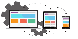
Responsive design is an approach to web design that ensures a website adapts seamlessly to different screen sizes, orientations, and devices. This means that whether your visitors are accessing your site on a desktop computer, a tablet, or a smartphone, they will have a consistent and optimized browsing experience. Responsive design achieves this by using flexible grids, layouts, and media queries to dynamically adjust the content based on the device being used.
Why Responsive Design Matters?
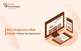
The shift towards mobile browsing has reshaped user expectations. Visitors demand websites that load quickly, look great, and are easy to navigate regardless of the device they’re using. A failure to meet these expectations can result in high bounce rates, decreased conversions, and ultimately, lost opportunities for your business or brand.
By embracing responsive design, you not only improve the user experience but also enhance your site’s search engine visibility. Search engines like Google prioritize mobile-friendly websites in their rankings, meaning that a responsive design can positively impact your site’s SEO performance.
Building Mobile-Friendly Websites with WordPress

WordPress, the world’s leading content management system (CMS), offers a myriad of tools and features specifically designed to facilitate responsive web design. Whether you’re a seasoned developer or a novice user, you can leverage WordPress to create stunning, mobile-friendly websites with ease.
1. Choose a Responsive Theme: The first step in building a mobile-friendly website with WordPress is selecting a responsive theme. WordPress offers a vast selection of themes that are optimized for responsiveness, meaning they automatically adjust to fit different screen sizes without compromising on aesthetics or functionality. When browsing for themes, look for ones that explicitly advertise themselves as “responsive” or “mobile-friendly.”
2. Optimize Content for Mobile: Once you’ve chosen a responsive theme, it’s essential to optimize your content for mobile viewing. Keep paragraphs short and concise, use high-quality images that load quickly, and ensure that buttons and navigation elements are large enough to tap on a touchscreen device. WordPress makes it easy to preview how your content will appear on mobile devices, allowing you to fine-tune the layout and design accordingly.
3. Utilize Responsive Plugins: WordPress offers a vast ecosystem of plugins that extend the platform’s functionality in countless ways. When it comes to responsive design, there are plugins available that can help you optimize images, improve page speed, and even create mobile-specific versions of your site’s content. By strategically leveraging these plugins, you can further enhance the mobile-friendliness of your WordPress website.
4. Test Across Devices: Before launching your website, it’s crucial to thoroughly test its responsiveness across various devices and screen sizes. Use tools like Google’s Mobile-Friendly Test or simply view your site on different smartphones, tablets, and desktop computers to ensure everything looks and functions as intended. Address any issues or inconsistencies that arise during testing to provide the best possible experience for your visitors.
Conclusion
In an increasingly mobile-centric world, having a responsive website is no longer optional—it’s a necessity. With WordPress and its robust suite of responsive design tools and features, building a mobile-friendly website has never been more accessible. By choosing a responsive theme, optimizing your content for mobile, utilizing responsive plugins, and thoroughly testing across devices, you can create a seamless and engaging browsing experience for your audience, regardless of how they access your site. Embrace responsive design with WordPress, and unlock the full potential of your online presence.