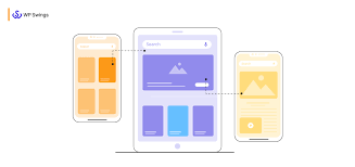
In an era dominated by diverse devices and screen sizes, it’s imperative for website owners to prioritize responsive design. With WordPress powering over 40% of the web, optimizing your WordPress site for all devices is no longer an option – it’s a necessity. In this article, we’ll explore key strategies to ensure your WordPress site looks great on desktops, tablets, and smartphones, providing an optimal user experience for all visitors.
Choose a Responsive WordPress Theme:

Selecting the right theme lays the foundation for a responsive website. Opt for a WordPress theme that is explicitly labeled as “responsive.” These themes dynamically adjust layout and content to different screen sizes, ensuring a seamless experience across devices.
Test Responsiveness Regularly:

Regular testing across various devices is crucial to identify potential issues. Utilize tools like Google’s Mobile-Friendly Test or browser developer tools to assess how your site performs on different screen sizes. Ensure that elements are correctly aligned, fonts are legible, and images scale appropriately.
Optimize Images for Faster Loading:

Large, unoptimized images can significantly impact your site’s loading speed, especially on mobile devices. Use image compression tools to reduce file sizes without compromising quality. Additionally, leverage responsive image techniques, such as the “srcset” attribute in HTML, to deliver appropriately sized images based on the user’s device.
Prioritize Mobile Navigation:

Navigation is a critical aspect of user experience. Simplify and streamline your website’s navigation menu for mobile users. Consider using a hamburger menu or a compact menu design to save screen space and make navigation intuitive on smaller screens.
Implement Fluid Grids and Flexible Typography:
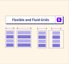
Create a fluid grid layout that adapts to different screen sizes. Utilize CSS media queries to define breakpoints where the layout or styling should change for optimal viewing. Additionally, implement flexible typography using relative units like percentages or “em” to ensure text remains readable on all devices.
Utilize WordPress Plugins for Responsiveness:
Several WordPress plugins can assist in optimizing your site for different devices. Consider using plugins that offer features such as mobile-friendly sliders, adaptive tables, or mobile-specific widgets. However, be mindful of plugin compatibility and performance impacts.
Enable Browser Cache:
Enabling browser caching helps reduce loading times for returning visitors. This is especially crucial for mobile users who may have slower internet connections. Use caching plugins like W3 Total Cache or WP Super Cache to enhance your site’s performance.
Stay Updated:
Regularly update your WordPress core, themes, and plugins to benefit from the latest features, security patches, and performance improvements. Outdated elements can pose compatibility issues and hinder responsiveness.
Conclusion:
In today’s digital landscape, a responsive WordPress site is essential for attracting and retaining visitors across a multitude of devices. By following these strategies and staying vigilant about ongoing optimization, you can ensure that your WordPress site not only looks great but also provides a stellar user experience, regardless of the device your audience uses to access it.