- The SOFR Swaps market is now mature and fully developed.
- Almost all activity in OTC markets longer than 2 years is now traded versus SOFR.
- We analyse the data behind the trading activity.
- What structures trade across which tenors?
Transparency data allows us to look at the distribution of risk across the curve. We may be used to seeing activity concentrated in benchmark tenors such as 2Y, 5Y, 10Y and 30Y in US markets, but have SOFR swaps developed in a similar manner?
As a starter the ISDA-Clarus RFR Adoption Indicator shows the amount of DV01 transacted in SOFR each month that is traded in tenors longer than 2Y:
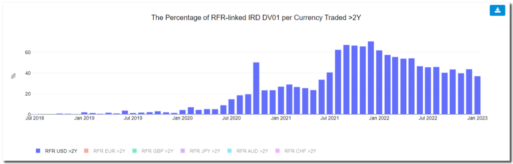
This has been a closely watched chart here at Clarus during the transition period as we looked for evidence that:
- SOFR activity is increasing in terms of risk traded.
- SOFR activity is spreading across the curve.
- SOFR activity is demonstrably different to Fed Funds activity. It is not only sub-2Y activity.
The distribution of risk across the curve in SOFR has been fairly consistent since the middle of last year. About 40% of total SOFR risk is traded in tenors longer than 2Y (+/- 5%). This is across OTC and Futures markets.
We also find that virtually all OTC activity has now transitioned to SOFR trading in tenors above 2Y. All long-dated trading is basically transacted vs SOFR:
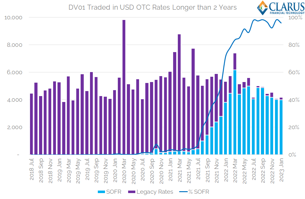
Showing;
- The DV01 of USD OTC products traded in maturities longer than 2 years each month.
- Trades that are not versus SOFR are marked vs “Legacy Rates”, covering USD LIBOR and Fed Funds.
- Virtually all risk longer than 2 years in OTC products is now traded versus SOFR.
I really should have shown this chart before! It would have fitted in well with our Fed Funds commentary, and is probably the best demonstration of how complete transition to SOFR is for large swathes of the market.
SOFR Break-down
So we know that SOFR is the most popular choice of index for long-dated trading in OTC markets. Great!
Delving elsewhere into the great Clarus resource of OTC knowledge (!), SDRView allows us to look at transaction level detail. Seeing as SOFR has made up over half of all risk traded in OTC markets since December 2021, that seems a fair time period to start analysing popular SOFR characteristics.
SOFR Start Dates
Let’s start simple. Analysing the start date of SOFR swaps by trade number. This data covers all trading activity – both On-SEF and Off-SEF and across Dealer and Client markets.
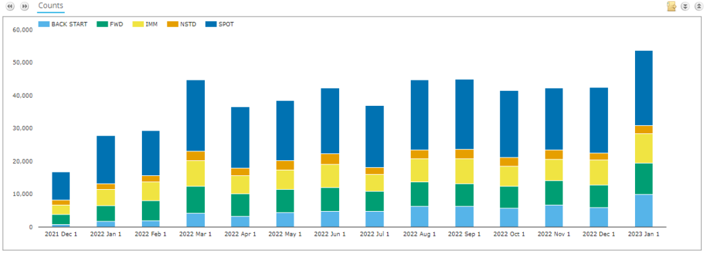
Showing;
- Spot-starting trades are by far the most popular start date for SOFR swaps. Nearly 50% of SOFR trades every month are spot-starting.
- If we group IMM and Fwd starting swaps together, we find that they are the next most popular form of SOFR swaps – making up 34% of all trades (30-40% in any given month).
- In terms of forward-starting trades only, about half of forward start dates correspond to IMM dates (is this therefore all hedge fund/speculative activity?).
- One to watch – there has been a large increase in the number of back-starting SOFR swaps in recent times. In January 2023, over 18% of trades (by trade count) were back-dated – a new high.
- (I guess this is to be expected? As SOFR trading becomes the norm, there is a larger back-book to manage and more SOFR swaps to terminate/novate/manage.)
Analysing Spot Trades
Drilling down into Spot-starting trades alone- let’s look at what package types are trading.
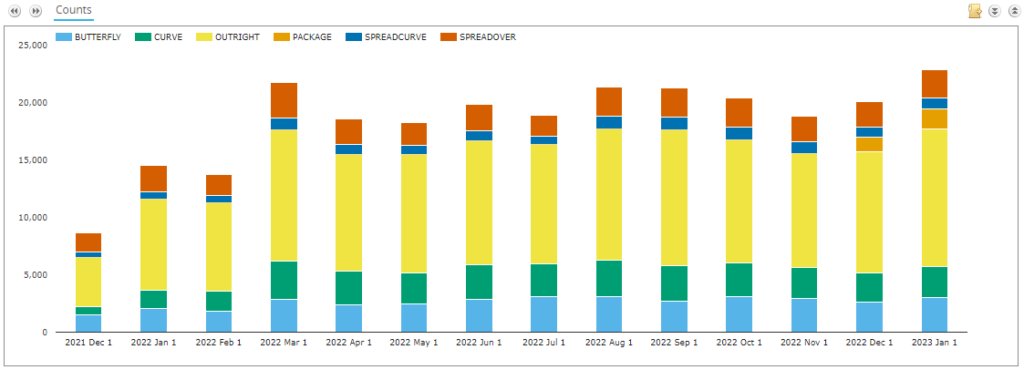
As regular readers will know, there have been recent changes in the identification of packages in DTCC data. Rather than concentrate on that “live” data issue, let’s take a look at what have been the most identified packages over a longer period of time in Clarus data:
- Over half of all trades are marked as “outrights” – we are not able to identify these as part of any particular package.
- Spreadovers and spreads of spreadovers – i.e. swaps traded as spreads to underlying US Treasury bonds, account for nearly 20% of trades.
- About 15% of trade legs are marked as belonging to a butterfly package. Of course, butterflies have 3 legs so maybe not surprising.
- And Curve trades make up 14% of trading.
Tenors Traded
We know that spot-starting outright trades are the most popular SOFR trades. Drilling further into these, what tenors are the most popular?
The chart below is a good representation of trading activity in my opinion:
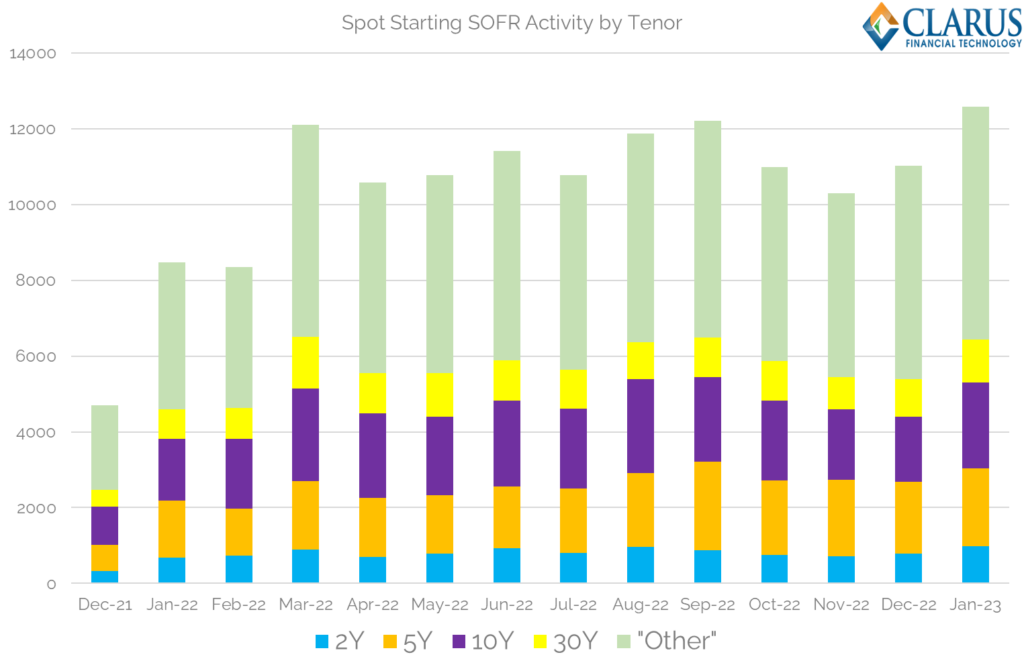
Showing;
- Number of transactions per month per tenor in spot starting SOFR swaps.
- Over 50% of activity each month is concentrated in just 4 tenors.
- We have used trade count to avoid complications over notionals, capped amounts etc.
- 7% of total trades are in 2 years.
- 16% of trades in 5Y.
- 19% in 10Y (!).
- 9% in 30Y.
Astounding that nearly 20% of trades are in a single tenor.
Talking of which, I am aware that the above won’t be enough granularity for some of our regular readers. If we assume that Q4 2022 was a representative period for SOFR activity, we see the following average daily number of trades per tenor:
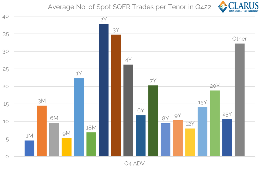
Showing;
- Average number of trades per day during Q4 2022 across select tenors in spot-starting SOFR trades (assuming 60 trading days in the quarter – relatively short due to Thanksgiving, Christmas holidays).
- The chart omits 5Y, 10Y and 30Y tenors for legibility. I have included 2Y for context.
- It is a good representation of how active the longer part of the curve is. There are more 25 year trades per day than 1 month, even when the Fed is hiking rates!
- Almost all Tenors longer than 1Y have at least 10 trades per day. That is pretty good going for a periodic market.
Notional/DV01 Amounts Traded
Finally, we can show average notionals traded per tenor per day. Unsurprisingly, they tail off along the curve due to duration:
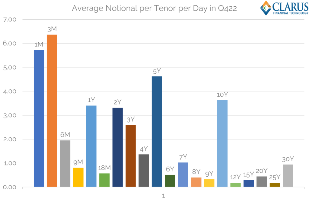
Showing;
- 11 tenors with average notional amounts at or above $1bn notional equivalent per day.
I don’t want to dwell on this chart, because activity should always be reflected in DV01 terms (as per the RFR Adoption Indicator). Therefore, a fairer representation of activity per tenor is shown below:
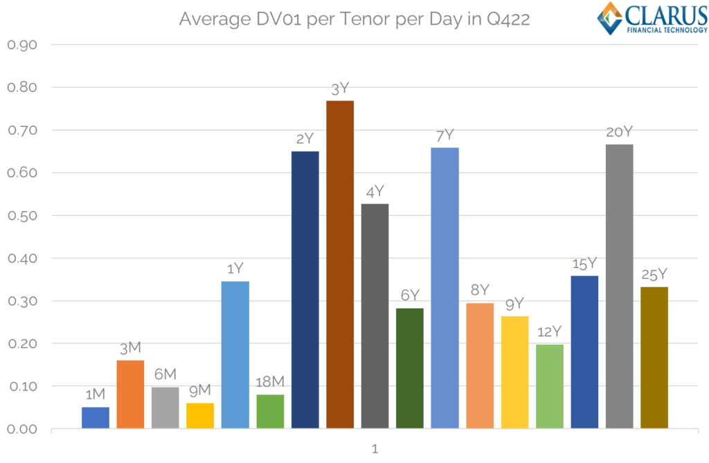
Showing;
- Average DV01 per day during Q4 2022 across select tenors in spot-starting SOFR trades.
- The chart omits 5Y, 10Y and 30Y tenors for legibility; includes 2Y for context.
- It is a really good representation of how active the longer part of the curve is. 20 year trades the same amount of risk as 2Y!
- 12Y sees the least amount of risk on this chart, and even that is ~ $200m in DV01 daily. Impressive stats.
In Summary
- The data shows that SOFR is an extremely mature market, with large activity across the whole curve.
- Almost 100% of OTC trading in tenors longer than 2 years is now transacted versus SOFR, replacing USD LIBOR for new activity.
- Spot-starting trades make up about half of all SOFR activity.
- About half of these spot starting trades are outrights – the other half being traded as part of a package.
- And about half of all activity in these standard swaps occurs in just 4 tenors – 2Y, 5Y, 10Y and 30Y.
- In addition, there are at least 15 tenors where $200m or more in DV01 is transacted each day across more than 10 trades. Those are impressively large numbers for a periodic market such as swaps trading.